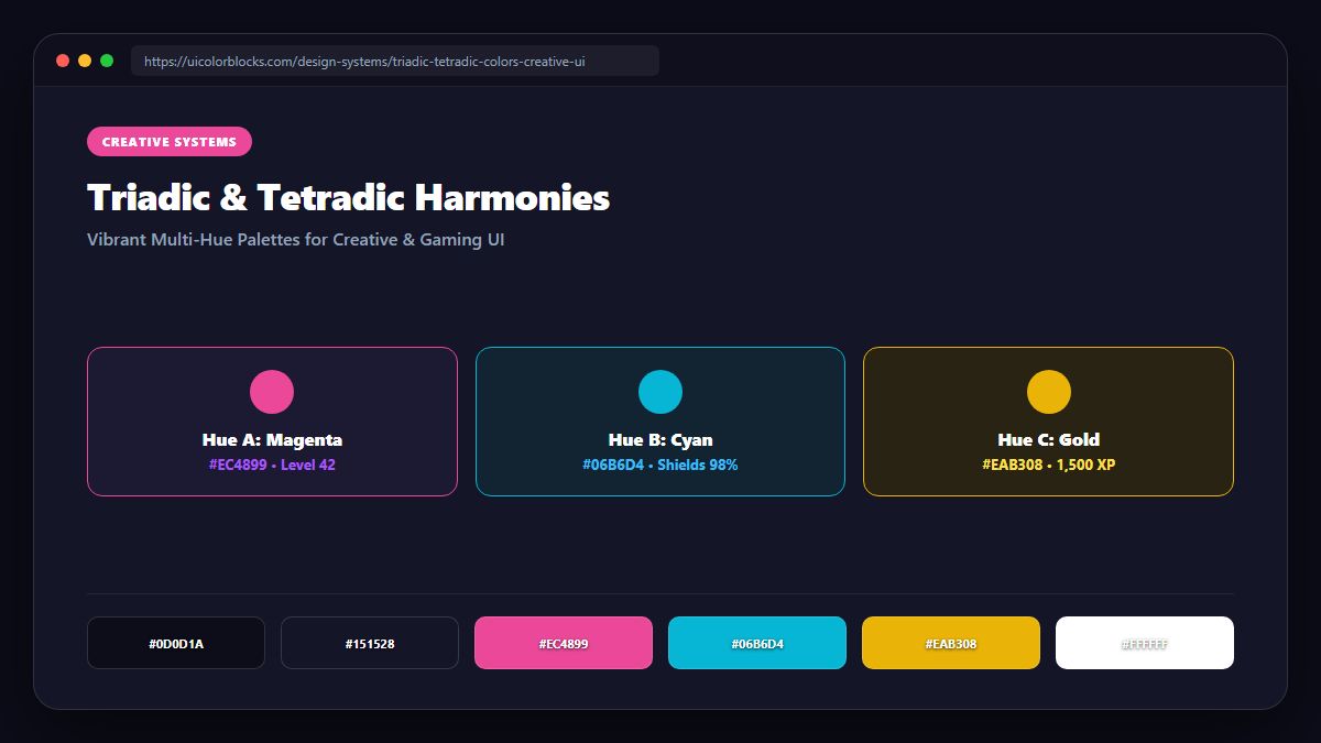
1. Deconstructing the Triad: 120° Equilateral Balance
A triadic scheme connects three points separated by 120°. The classic triad combines Red, Yellow, and Blue, but digital interfaces thrive on more sophisticated tertiary triads, such as Purple (#8b5cf6), Amber (#f59e0b), and Teal (#06b6d4).
/* Sophisticated Triadic Creative Tokens */
:root {
  --triad-canvas: #09090b;
  --triad-card: #18181b;
  --triad-h1: #8b5cf6;         /* Purple 120° */
  --triad-h2: #06b6d4;         /* Teal 240° */
  --triad-h3: #f59e0b;         /* Amber 360° (0°) */
  --triad-text: #f4f4f5;
}
2. The Hierarchy Dictator: One Hero, Two Sidekicks
If you treat all three triadic colors equally, the interface will look like a toy store catalog. Designate one color as the visual hero (primary brand identity) and use the remaining two strictly for secondary highlights and badge categories.
| Color Role | Recommended Weight | Application Target | Visual Emotion |
|---|---|---|---|
| Primary Hero (Purple) | 70% of color | Key navigation, buttons, brand logo | Depth and modern flair |
| Secondary (Teal) | 20% of color | Data charts, active card tags | Freshness and balance |
| Tertiary (Amber) | 10% of color | Notification badges, star ratings | Warmth and urgency |
3. Tetradic (Double Complementary) Complexity Control
Tetradic schemes incorporate four colors arranged in two complementary pairs. Because managing four vivid hues simultaneously can overwhelm layout hierarchy, modern frontends anchor three of the colors inside muted illustrations while leaving the core UI quiet.
4. Summary Best Practices for Creative Portals
Triadic schemes shine when you need joyful, memorable brand differentiation. Explore our 100k Colors Matrix to discover procedurally generated triadic harmonies for your next creative project.
5. Implementation Blueprint & Token Architecture
Translating theoretical color principles into production code requires consistent design token binding. When engineers hardcode ad-hoc hexadecimal values directly inside component CSS classes, theme parity breaks down and maintaining accessibility becomes an ongoing liability. By adopting disciplined semantic variables, your frontend application can swap themes, adapt to high-contrast operating system preferences, and enforce strict accessibility thresholds across every viewport.
When architecting your color tokens, establish an invariant rule: UI components must consume semantic tokens rather than raw primitives. This abstraction layer ensures that updating your brand identity or adjusting dark mode surface elevations requires changing values in a single centralized design token stylesheet rather than executing search-and-replace across thousands of individual CSS or JSX files.
/* Centralized Design Token Integration Blueprint */
:root {
  --color-canvas-base: #f8fafc;
  --color-surface-card: #ffffff;
  --color-border-subtle: rgba(0, 0, 0, 0.08);
  --color-text-primary: #0f172a;
  --color-text-muted: #64748b;
  --color-interactive-primary: var(--brand-500);
  --color-interactive-hover: var(--brand-600);
}

[data-theme="dark"] {
  --color-canvas-base: #080810;
  --color-surface-card: #16162a;
  --color-border-subtle: rgba(255, 255, 255, 0.08);
  --color-text-primary: #f0f0fa;
  --color-text-muted: #a0a0c0;
  --color-interactive-primary: var(--brand-400);
  --color-interactive-hover: var(--brand-500);
}
For frontend engineering teams using modern utility-first CSS frameworks like Tailwind CSS, export your verified semantic tokens directly into your tailwind.config.js file. This creates autocompleted utility classes such as bg-surface-card and text-interactive-primary, ensuring developers build accessible, harmonious interfaces without leaving their editor.
Put These Tokens into Practice
Explore our interactive design tools to test contrast ratios, generate 50–950 shade steps, or discover harmonious color palettes.