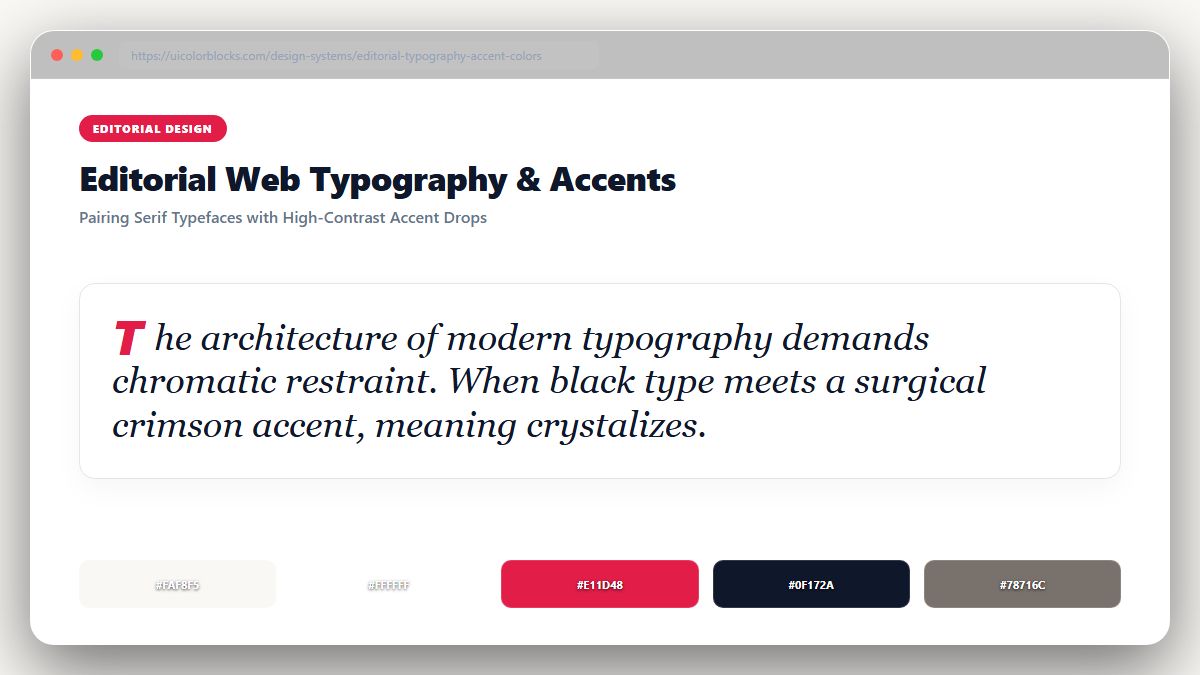
1. The Timeless Newspaper Canvas: Warm Newsprint and Deep Ink
Pure white (#ffffff) creates excessive optical glare during sustained reading. Classical print design has relied on unbleached rag paper (#fbfbf9 or #f9f8f3) for centuries. Pairing soft newsprint canvases with rich ink black (#18181b) maximizes reading endurance while honoring literary heritage.
/* Editorial Long-Form Reading Tokens */
:root {
  --read-canvas: #fbfbf9;      /* Warm archival newsprint */
  --read-ink: #18181b;         /* Deep readable typography */
  --read-meta: #71717a;        /* Byline and publish date */
  --read-accent: #b91c1c;      /* Crimson editorial drop cap */
  --read-quote-border: #d4d4d8;/* Clean pull-quote bar */
}
2. The Single-Accent Rule in Long-Form Publishing
In high-end editorial layouts, you should introduce exactly ONE accent color per publication—frequently an authoritative Crimson Red (#b91c1c), Forest Green (#15803d), or Academic Indigo (#1e3a8a). Use this single accent strictly for section headers, drop caps, and author links.
| Element | Recommended Color | Typographic Pairing | Reading Effect |
|---|---|---|---|
| Article Body | Deep Ink (#18181b) | Serif (Georgia, Charter, Merriweather) | Effortless continuous flow |
| Editorial Accent | Crimson (#b91c1c) | Sans-Serif (Plus Jakarta Sans) | Instant section orientation |
| Pull Quotes | Soft Ink (#3f3f46) | Italic Serif with left border | Visual pausing points |
3. Reading Mode Optimization: Dark Sepia and Night Inks
Many readers read late at night. Instead of jarring black, provide a warm sepia mode (#2c2523 background with #e8dfd8 text) that filters out harsh blue light and mimics evening book reading.
4. Summary Best Practices for Digital Publications
Never use colored text for body paragraphs. Guarantee reading contrast exceeds 9:1, and test your font-to-background combinations with our WCAG Contrast Checker.
5. Implementation Blueprint & Token Architecture
Translating theoretical color principles into production code requires consistent design token binding. When engineers hardcode ad-hoc hexadecimal values directly inside component CSS classes, theme parity breaks down and maintaining accessibility becomes an ongoing liability. By adopting disciplined semantic variables, your frontend application can swap themes, adapt to high-contrast operating system preferences, and enforce strict accessibility thresholds across every viewport.
When architecting your color tokens, establish an invariant rule: UI components must consume semantic tokens rather than raw primitives. This abstraction layer ensures that updating your brand identity or adjusting dark mode surface elevations requires changing values in a single centralized design token stylesheet rather than executing search-and-replace across thousands of individual CSS or JSX files.
/* Centralized Design Token Integration Blueprint */
:root {
  --color-canvas-base: #f8fafc;
  --color-surface-card: #ffffff;
  --color-border-subtle: rgba(0, 0, 0, 0.08);
  --color-text-primary: #0f172a;
  --color-text-muted: #64748b;
  --color-interactive-primary: var(--brand-500);
  --color-interactive-hover: var(--brand-600);
}

[data-theme="dark"] {
  --color-canvas-base: #080810;
  --color-surface-card: #16162a;
  --color-border-subtle: rgba(255, 255, 255, 0.08);
  --color-text-primary: #f0f0fa;
  --color-text-muted: #a0a0c0;
  --color-interactive-primary: var(--brand-400);
  --color-interactive-hover: var(--brand-500);
}
For frontend engineering teams using modern utility-first CSS frameworks like Tailwind CSS, export your verified semantic tokens directly into your tailwind.config.js file. This creates autocompleted utility classes such as bg-surface-card and text-interactive-primary, ensuring developers build accessible, harmonious interfaces without leaving their editor.
Put These Tokens into Practice
Explore our interactive design tools to test contrast ratios, generate 50–950 shade steps, or discover harmonious color palettes.