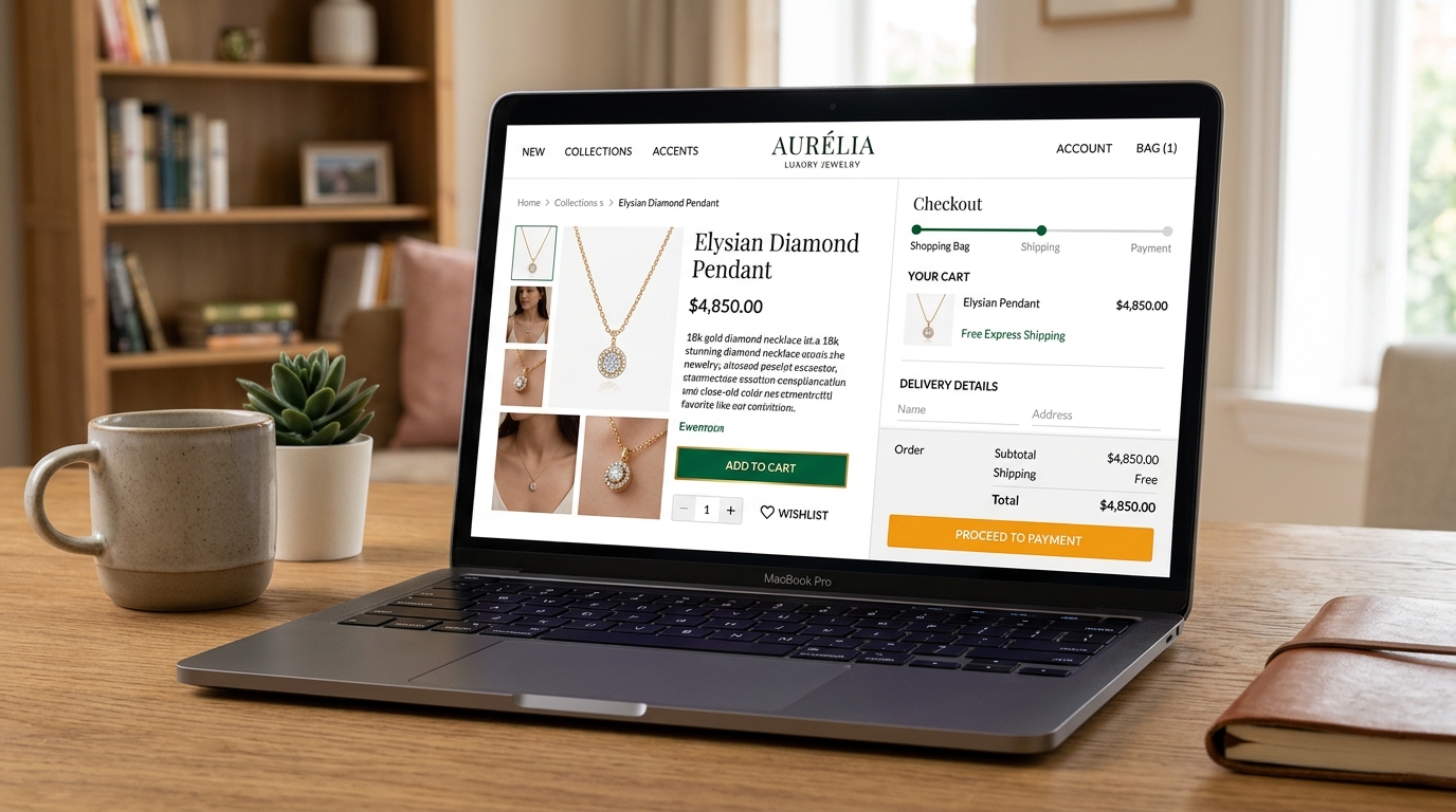
1. Neutral Canvas Principle: Let the Product Photography Lead
A retail storefront should act like an art gallery: the walls must never compete with the paintings. Overly saturated navigation bars or tinted product cards distort the customer’s perception of item colors. Top luxury and direct-to-consumer brands use clean alabaster whites (#ffffff, #fafafa) and neutral charcoal typography (#18181b) to guarantee true-to-life product presentation.
/* Minimalist E-Commerce Surface Tokens */
:root {
  --shop-bg: #fafafa;
  --shop-card: #ffffff;
  --shop-border: #e4e4e7;
  --shop-price: #09090b;
  --shop-sale-badge: #dc2626;  /* High-urgency discount badge */
  --shop-cart-btn: #16a34a;    /* High-confidence add to cart */
}
2. Urgency vs. Trust: The Dual Roles of Red and Green
Discount banners and low-stock alerts require chromatic urgency: warm crimson (#dc2626) triggers immediate attention. However, when customers transition to the payment step, urgency turns into anxiety. Checkout inputs and security reassurance seals must switch to calming emerald greens (#16a34a) and secure banking blues (#0284c7) to reassure buyers that transactions are encrypted and safe.
| Funnel Stage | Optimal Hue | Psychological Trigger | Target Component |
|---|---|---|---|
| Discovery | Warm Charcoal (#18181b) | Elegance & clarity | Product titles & navigation |
| Evaluation | Crimson (#dc2626) | Scarcity & urgency | "Only 2 Left in Stock" tag |
| Checkout | Forest Green (#16a34a) | Safety & completion | "Complete Purchase" CTA button |
3. Overcoming "Add to Cart" Contrast Failures on Mobile
Mobile shoppers view storefronts in high-glare environments—on sunny streets or commuter trains. Low-contrast pastel buttons lose up to 30% of taps due to ambient washout. A primary purchase button must meet at least 5.5:1 contrast against the sticky bottom container background.
4. Summary Rules for E-Commerce Color Systems
Never use more than one high-urgency accent on a single product detail screen. Keep product card backgrounds pure white or subtle warm off-white, and verify button tap target contrast with our WCAG Contrast Guide.
5. Implementation Blueprint & Token Architecture
Translating theoretical color principles into production code requires consistent design token binding. When engineers hardcode ad-hoc hexadecimal values directly inside component CSS classes, theme parity breaks down and maintaining accessibility becomes an ongoing liability. By adopting disciplined semantic variables, your frontend application can swap themes, adapt to high-contrast operating system preferences, and enforce strict accessibility thresholds across every viewport.
When architecting your color tokens, establish an invariant rule: UI components must consume semantic tokens rather than raw primitives. This abstraction layer ensures that updating your brand identity or adjusting dark mode surface elevations requires changing values in a single centralized design token stylesheet rather than executing search-and-replace across thousands of individual CSS or JSX files.
/* Centralized Design Token Integration Blueprint */
:root {
  --color-canvas-base: #f8fafc;
  --color-surface-card: #ffffff;
  --color-border-subtle: rgba(0, 0, 0, 0.08);
  --color-text-primary: #0f172a;
  --color-text-muted: #64748b;
  --color-interactive-primary: var(--brand-500);
  --color-interactive-hover: var(--brand-600);
}

[data-theme="dark"] {
  --color-canvas-base: #080810;
  --color-surface-card: #16162a;
  --color-border-subtle: rgba(255, 255, 255, 0.08);
  --color-text-primary: #f0f0fa;
  --color-text-muted: #a0a0c0;
  --color-interactive-primary: var(--brand-400);
  --color-interactive-hover: var(--brand-500);
}
For frontend engineering teams using modern utility-first CSS frameworks like Tailwind CSS, export your verified semantic tokens directly into your tailwind.config.js file. This creates autocompleted utility classes such as bg-surface-card and text-interactive-primary, ensuring developers build accessible, harmonious interfaces without leaving their editor.
Put These Tokens into Practice
Explore our interactive design tools to test contrast ratios, generate 50–950 shade steps, or discover harmonious color palettes.